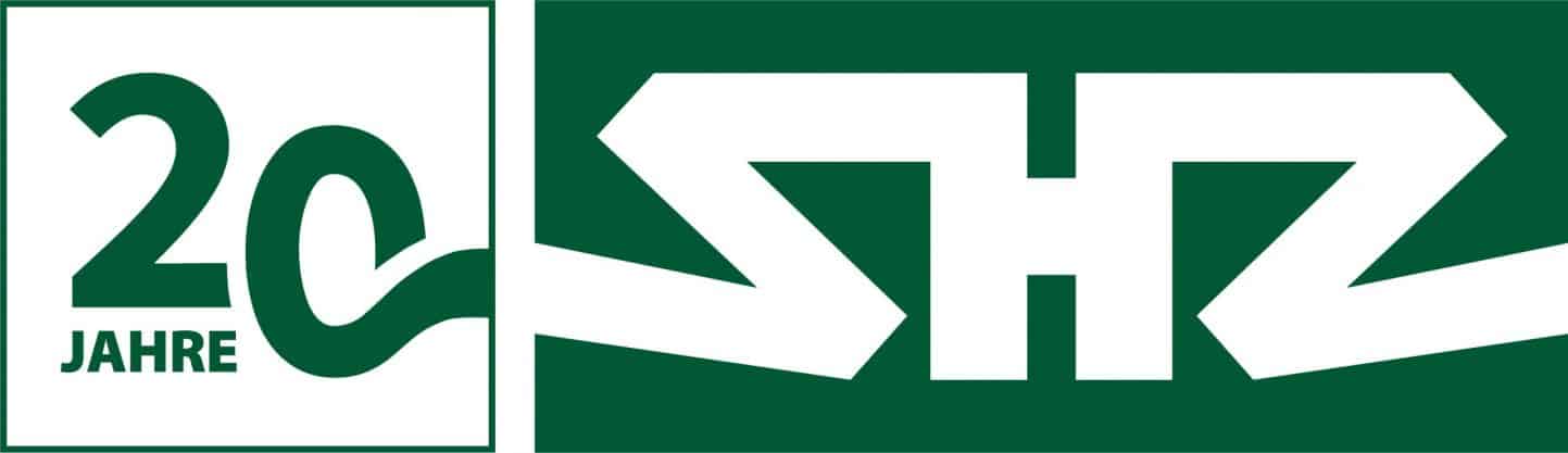


SHZ brand relaunch: new logo with claim
Sächsische Hebe- und Zurrtechnik GmbH invests in brand relaunch - and presents a new logo with a claim in a first step
To strengthen sales communication, Sächsische Hebe- und Zurrtechnik GmbH has invested in a new branding. The relaunch of the SHZ logo is the first externally visible element of the new corporate design. The new logo creates a clear visual reference to the portfolio (lashing straps) and is intended to position the SHZ brand more strongly and more concisely in the market and in the awareness of existing and potential customers. “In addition to the construction of a new warehouse for 1.2 million euros, which will enable us to offer our customers significantly shorter production and delivery times from summer 2021, the professionalization of our brand image – especially our sales communication – is now a second important step towards the future. “, explains Matthias Böhme, managing director of SHZ GmbH, who runs the company together with his father Günter Böhme. In the first weeks of January 2021, the new logo was first presented to the employees. Due to the corona, the presentation was recorded on video. The employees could watch this video in small groups with sufficient distance or in the home office. “The video was very well received by our team, because despite the Corona restrictions, we were able to” mentally take “all employees with us and make it clear to them: in order to continue to grow successfully in the market, we have to get to the heart of our SHZ strengths and these communicate clearly – but also “louder” than before – to the outside world. “ says Matthias Böhme.
Starting point and goals of the brand relaunch
SHZ GmbH has grown significantly in recent years: In the period from 2008 to 2019, the company was able to increase its sales from 3 million to 9 million euros – and thus tripled. Every year around 7,000,000 meters of webbing are processed by SHZ GmbH. In order to do justice to this economic success story, the external appearance of the brand is now also to be professionalized. “The starting point for the new brand identity was the question of how we can get to the heart of the core of our identity and our high level of competence better than before. In the future, interested parties and potential new customers should be able to recognize at first glance which industry we are in. I think we have already succeeded in doing that with the new logo and claim. At the same time, with the professionalization of our brand image, we want to express the high level of competence and performance of our company more strongly than before – and thereby clearly differentiate ourselves from our competitors. Above all, the new website, which is currently under construction, will also contribute to this. “, says Günter Böhme, managing director of SHZ GmbH.
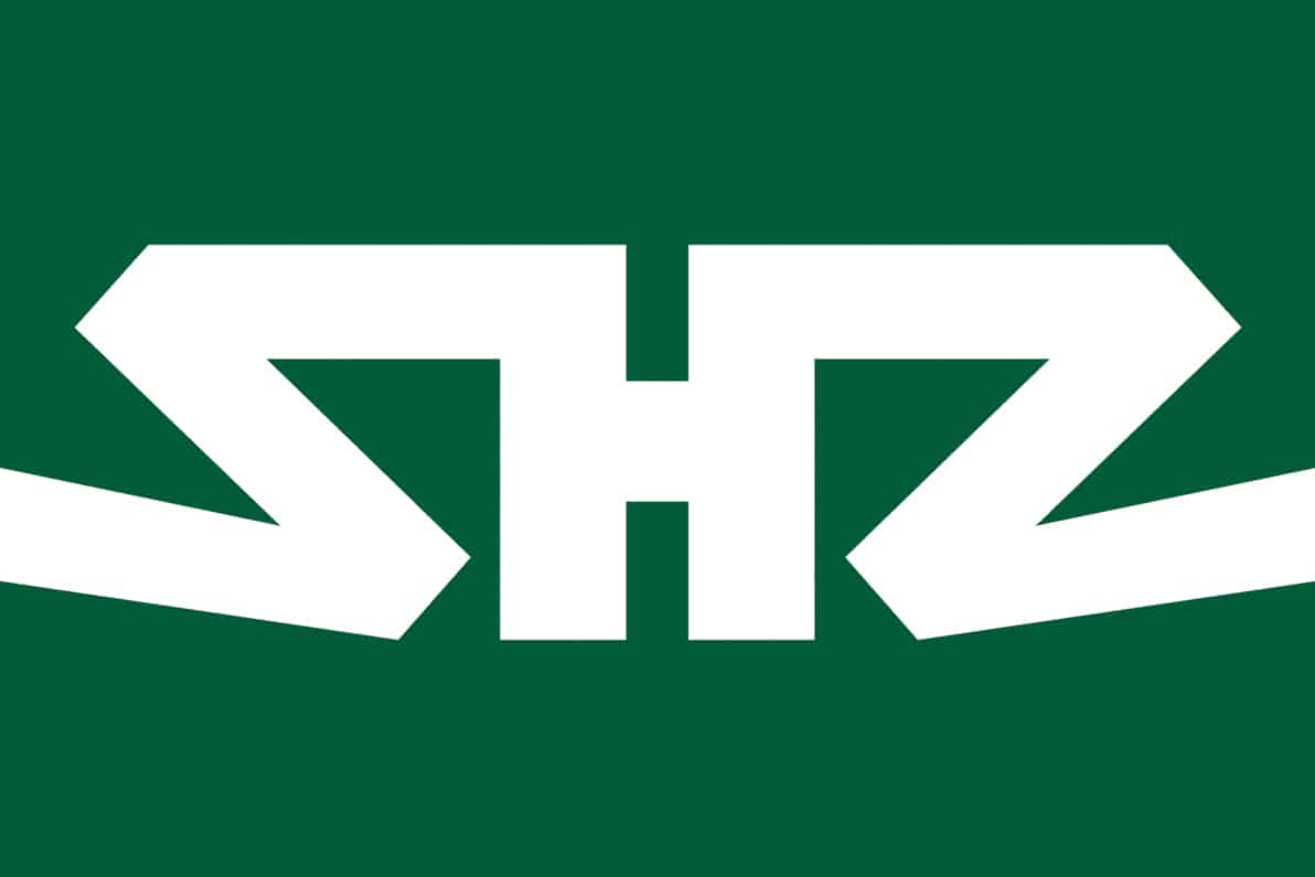
The new logo: Colours and symbolism
The colors
As a reminiscence of the Großröhrsdorf site in Saxony, which can look back on over 320 years of tradition in ribbon and belt weaving, a new, dark shade of green is the defining color of the new SHZ logo.
The symbolism
The new logo makes strong reference to the core competence of SHZ GmbH: the manufacture and trade of lashing straps and hoists that are required for the safe transport of heavy loads in industry and the logistics sector. The letters “SHZ” have been stylized in a modern, puristic and unique form, which ensures a high recognition value. In addition, they symbolize a zigzag lashing strap. The “H” in the middle was designed in such a way that it reminds of a lane – that is, a transport route. This expresses the visual reference to one of the most important target industries / clientele of SHZ GmbH, the logistics industry.
The shape
Due to the deliberately chosen robust, distinctive shape, the new logo has a high affinity to our target industries, which are also very powerful, strong and robust. I am thinking in particular of the steel industry, mechanical engineering and the logistics sector, ”says Günter Böhme, Managing Director of SHZ GmbH.
The new claim
The new SHZ logo is complemented by the concise claim: “Moving big things. With certainty. ”“ Moving big things ”refers ambiguously to the two goals that SHZ GmbH is pursuing with the brand relaunch.
- Goal 1: Sales communication
- Goal 2: The perception of SHZ GmbH as an attractive employer is to be strengthened. In this context, the slogan “Moving big things. With security “for the diverse opportunities that employees at SHZ GmbH as a family-run company with flat hierarchies have. Here, employees can and should even incorporate their own ideas into their work in order to initiate new projects and jointly drive the company’s progress forward.
Outlook and next steps
“The relaunch of our logo was an important first step towards strengthening the SHZ brand presence. In the next step we will revise our website and make it more modern, clearer and more user-friendly ” , says Matthias Böhme.

